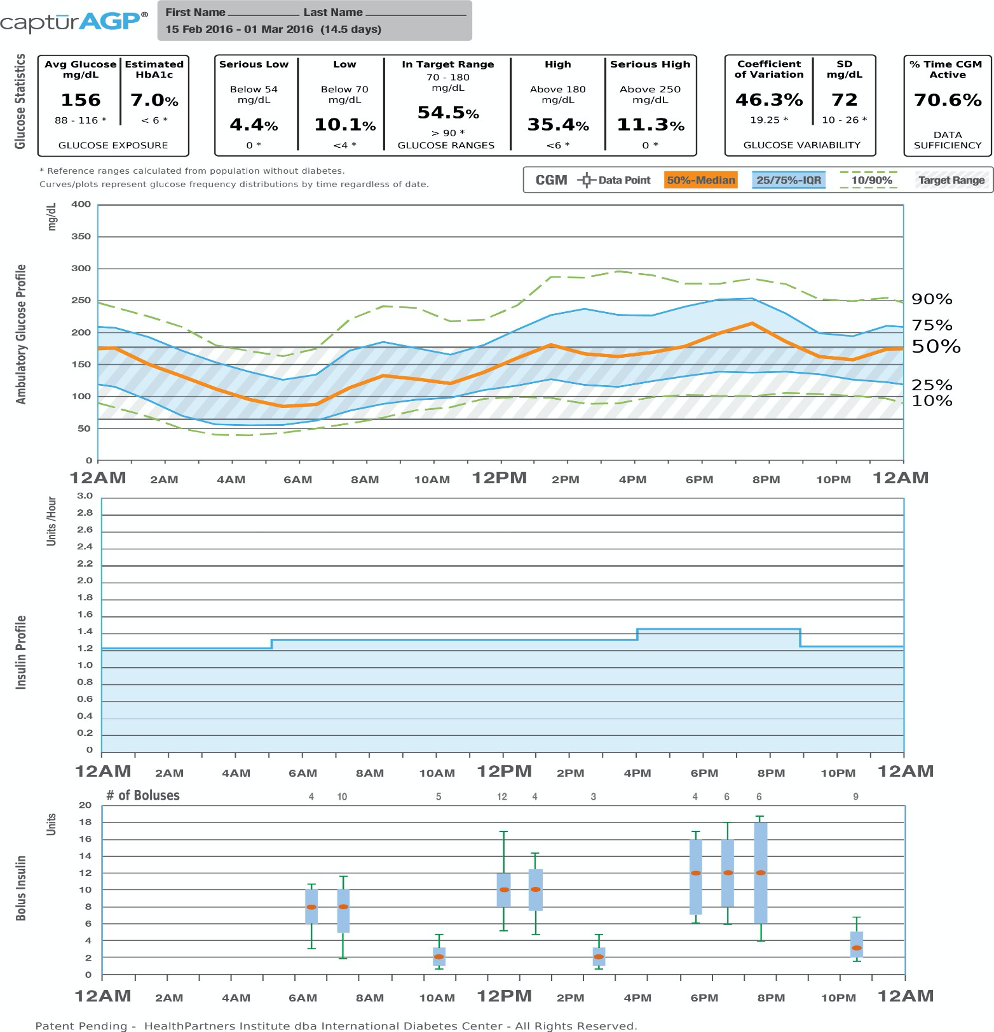
Figure 3: Ambulatory Glucose Profile for Insulin Pumps.
Glucose Statistics: Metrics include mean glucose, estimated A1C, glucose ranges, coefficient of variation and standard deviation.
Glucose Profile: Daily glucose profiles are combined to make a one-day (24-hour) picture. Ideally, lines would stay within grey shaded area (target range)
Orange: median (middle) glucose line
Blue: area between blue lines shows 50% of the glucose values
Green: 10% of values are above (90% top line) and 10% are below (10% bottom line) Insulin Profile Graph: Shows basal insulin pump settings over a 24-hour period
Bolus Insulin Graph: Combines all bolus insulin doses into one graph to make a one day (24-hour) picture. Each box on the graph covers 60 minutes of doses.
Orange: median (middle) dot
Blue: shaded box shows 50% of the bolus dosages in the hour
Green: lines above and below the shaded box (whiskers) show how many of the bolus dosages per hour were between 75 – 90% and between 10 – 25%